Analytics
Your Swapt home page — track visits, form submissions, and new vs. returning customers, then drill into the raw records and export them.
Analytics is your home page in Swapt — it's the first item in the left-hand menu and where you land when you sign in. It shows how people are engaging with everything you run: your QR campaigns, links, and pages.
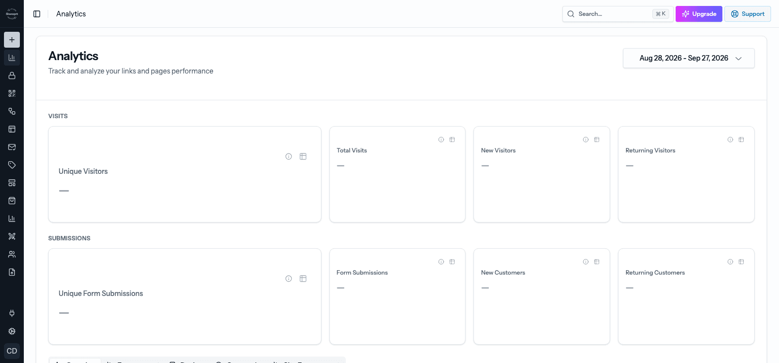
Pick a date range
Use the date picker at the top right to choose the period you want to see. By default it shows the last 30 days. Every tile, chart, and export on the page follows the range you pick.
The headline numbers
The tiles at the top are grouped into two families. Each tile also shows how it changed compared with the previous period.
Visits
- Unique Visitors — how many different people visited. This is the headline number, with a small trend line.
- Total Visits — every visit, including repeat visits from the same person.
- New Visitors — people whose very first visit falls in the period you picked.
- Returning Visitors — people who visited in this period and had visited before it too.
Submissions
- Unique Form Submissions — how many different customers submitted a form.
- Form Submissions — every form submission across all your campaigns.
- New Customers — people whose very first submission (matched by email) falls in this period.
- Returning Customers — people who submitted in this period and had submitted before it too.
Visitors are counted once per browser, and customers are counted once per email address — so the "unique" and "new vs. returning" numbers aren't inflated by the same person coming back. Preview test-runs are left out.
See the raw data behind a number
Every tile can be opened to show the individual records behind it.
On any tile, choose the small table icon (View raw data) in its corner.
A table opens with each record for the date range you picked. Page through it to browse.
Choose Export CSV to download every record behind that number — not just the page on screen — as a spreadsheet.
Charts and breakdowns
Below the tiles, tabs break your traffic down in different ways:
Visits Over Time shows daily visits, unique visitors, and submissions. Top Campaigns shows visits and conversions by campaign.
Button Clicks by Campaign shows how people interact with the buttons on your campaign pages.
Browser Distribution, OS Distribution, and Device Distribution show what people are scanning and browsing with.
Geographic Distribution shows where your visitors are, on a map.
Page views, time on page, scroll depth, referrers, and clicks from your own website — including Top pages, Top buttons, Top referrers, and Top campaigns (UTM). This tab needs the Swapt tracking snippet on your site; choose Install snippet to get set up.
More reports
- Flow analytics — each flow has its own step-by-step view so you can spot where people drop off. See Flow Builder.
- Channel Report — submissions broken down by where customers say they bought (beta).
- Yotpo Reviews — reviews your flows sent to Yotpo, by day and by product (beta).