Landing Pages
See which pages customers are landing on, manage your page templates, and build pages in the drag-and-drop editor.
Landing pages are what customers see after they scan a code. A page goes live only when a flow shows it with a Show Page step (or as the success page after a form), so the Landing Pages page is your inventory: what's in front of customers right now, and the templates you build from.
Find it under Rewards Hub → Landing Pages.
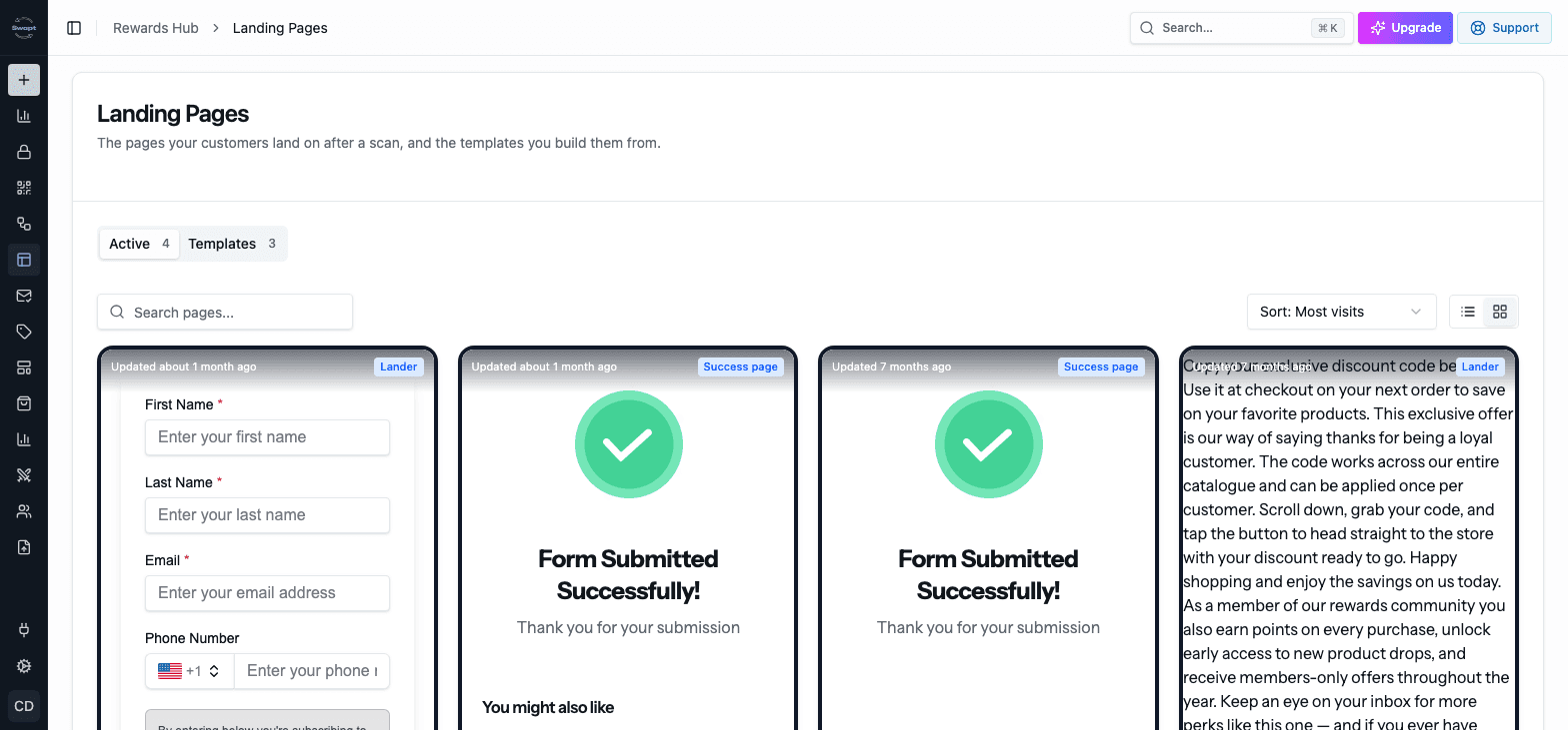
The two tabs
Every page a flow is currently using. Each one shows:
- Type — Lander or Success page.
- Used in — the flow it belongs to, marked Live in or Paused in depending on that flow.
- Visits and Conversion Rate.
- Updated — when it was last changed.
Search by page or flow name, sort (Most visits, Recently updated, Best conversion, Name), and switch between tiles and a table. Click Edit to open a page in the editor.
Nothing here publishes or pauses a page — that's controlled by the flow it's in.
Templates are starting points for new flow pages. Each one shows which flows use it, or Not used yet.
- Click New template, give it a name, and choose Create and open editor to start a blank template.
- Use the ⋯ menu on a template to Rename, Duplicate, or Delete it.
- You can also turn any flow page into a template from the editor with Save → Save as Template.
Editing a template that's already in use changes it everywhere it's used.
When you edit a page or template that more than one flow uses, Swapt warns you first ("This page is shared") and lists the flows it's in. Choose Edit all pages to go ahead, or Cancel.
Build a page in the editor
Open a page from Landing Pages, or add a Show Page step in a flow.
Drag blocks from the blocks panel onto the page. Use Search blocks to find one quickly.
Click a block to edit its content and style in the properties panel on the right.
Flip the Preview switch to try the page, then click Save. From the Save menu you can also Save and Publish or Save as Template.
Use the Form / Success switch at the top of the editor to move between the page itself and the success page customers see after they submit it.
Blocks
The blocks panel groups blocks by what they do. Here's what's in it.
The everyday building blocks:
- Text, Button, and Image
Forms:
- Form — collect customer details. See Forms.
- Step Content — show different content on each step of a multi-step form.
Under Special Features:
- Profile Image
- Promotion — show a reward or code from your Promotions.
- Product Review Button and Review Form
- Product Instructions
- Shop Now and Cross-Sell Carousel
- Game — Scratch Off, Spin the Wheel, Pick a Box, Slot Machine, Tap to Pop, or Flip the Card.
- Incentive Card
- Add to Wallet — only if Wallet Passes is switched on for your account.
Media:
- Video Player — upload a video or paste a YouTube or Vimeo link.
Layout:
- Section — a container with its own background color or image, Content Width, Min Height, border, corner radius, and shadow. Drop other blocks inside it.
- Row — place blocks side by side.
- Separator and Spacer
- Form Success — the message customers see on a success page.
Product Review Button
The Product Review Button sends customers to write a review. Its Data Source decides which product it points to:
- Campaign Product (auto) — the product attached to the campaign the customer scanned.
- Dynamic (from product) — the product the customer picked in a Product field on your form.
- Static (set values below) — products you enter yourself, each with a name, image, and review link.
Set Appearance to Button or Stars.
Buttons that continue the flow
On a page inside a flow, a Button has a Click Action: Open a link or Continue to next step. Use Continue to next step to move the customer on to the next step of the flow without a form.
Image links
Give an Image a Link URL (optional) to make it clickable.
Styling and spacing
Most blocks have Margin and Padding controls, so you can set the space around and inside each block.
To style the whole page, deselect all blocks so the properties panel shows the page's own settings. You can set a Background Color, or turn on Gradient Background and pick a Gradient Top Color and Gradient Bottom Color. You can also add a Background Image or Video, a Background Effect (like Stars or Fireworks), and a Page Title.
Buttons can use a gradient too — turn on Use Gradient in the button's settings.
Show blocks to the right people
Every block has two targeting settings:
- Show in countries — limit a block to visitors in the countries you choose. Leave it on Everywhere to show it to everyone. Visitors in other countries never receive that block.
- Show On — All devices, Mobile only, or Tablet & desktop only.
Text fields also have Add translation, so you can add wording for other languages.
Branding
Pages pick up your brand colors and fonts from your Library. Upload your own fonts there to use them on your pages.